A3
The concept for the interior of A3 project
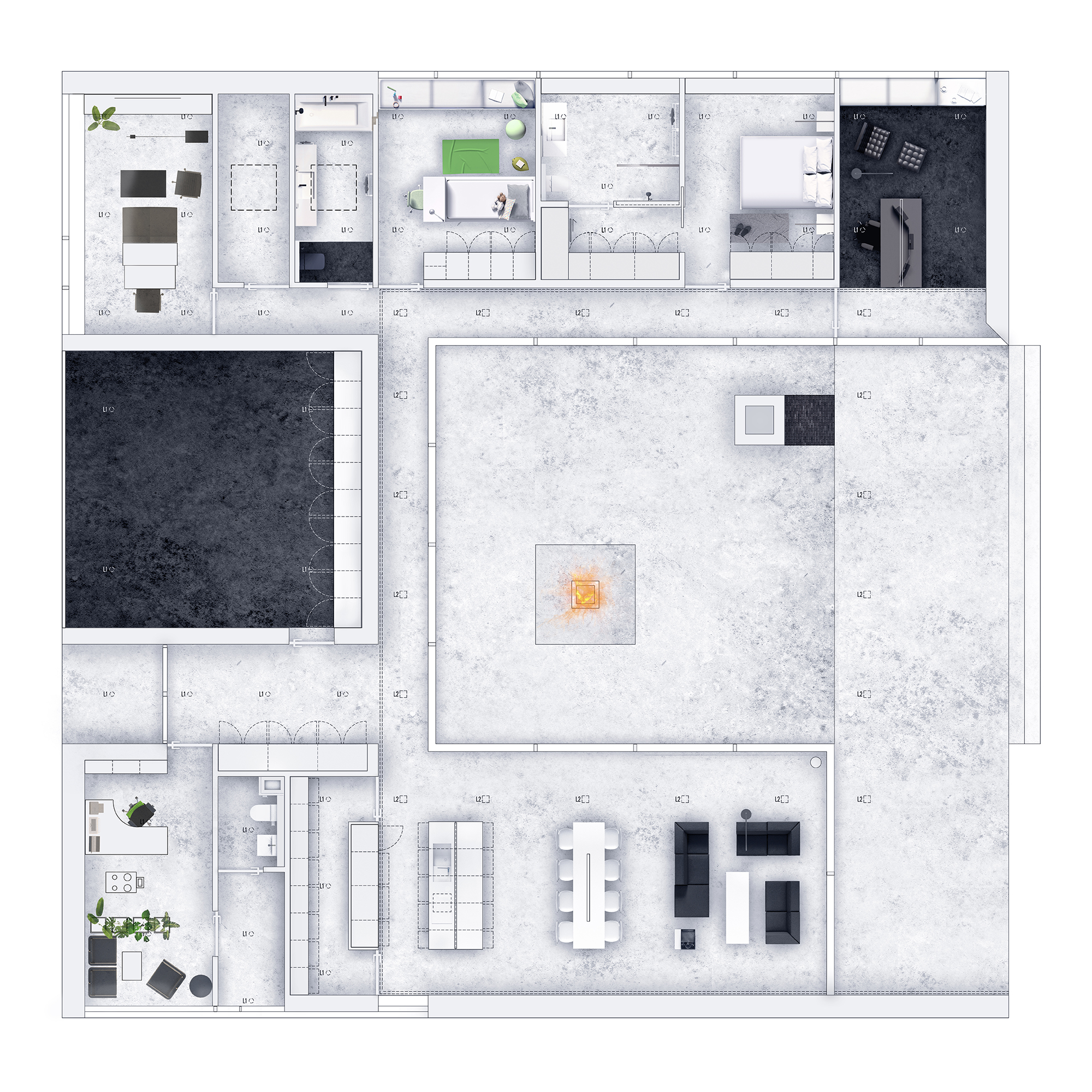
In contrast to the dark colors of the building facade, the interior is designed as light, with white walls and ceilings and a light gray concrete floor. The roofed outdoor terrace was treated as an extension of the interior and made of the same materials as the center of the building.
Guest Bathroom:
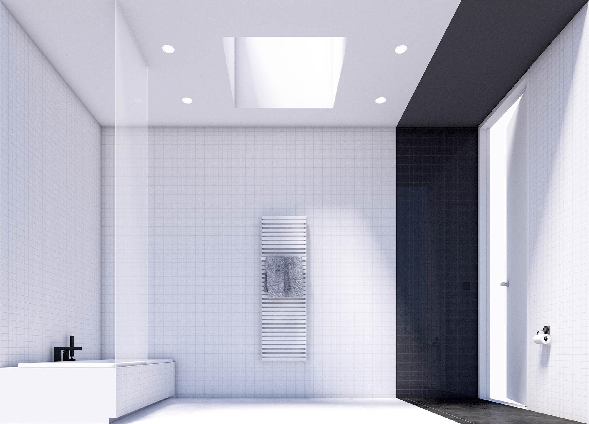
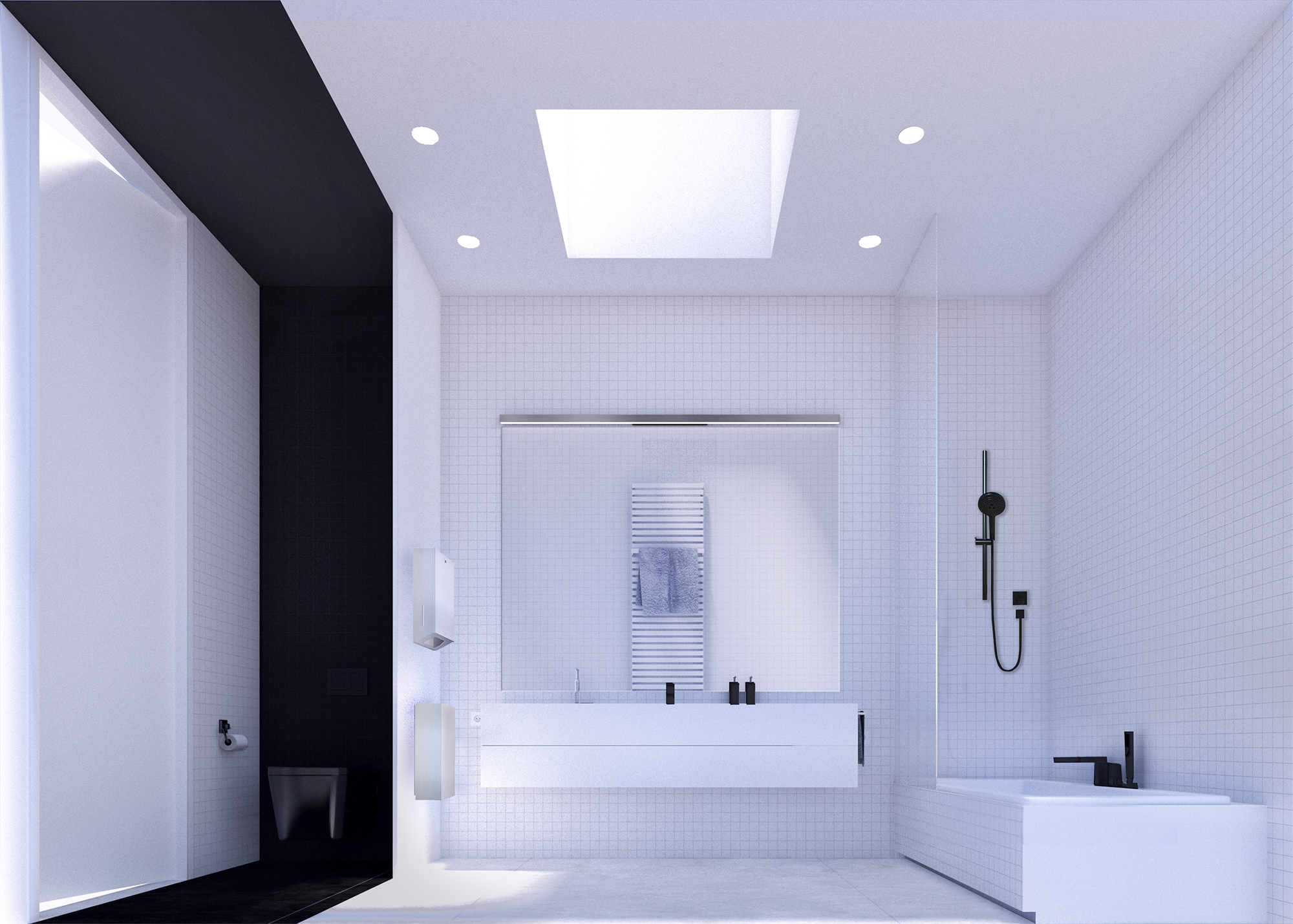
The bathroom color concept is a consequence of the color scheme of the whole house. The guest bathroom is divided into two functional zones contrasted with each other. To ensure the intimacy in this bathroom, the outside window was abandoned and natural lighting was provided by a square, mechanically opened skylight, located in the central part of the room.
Child’s room: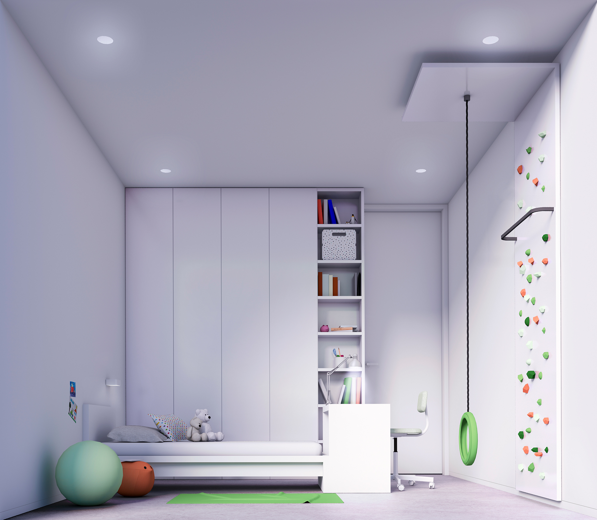
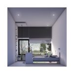
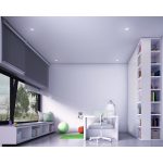
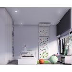
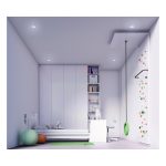
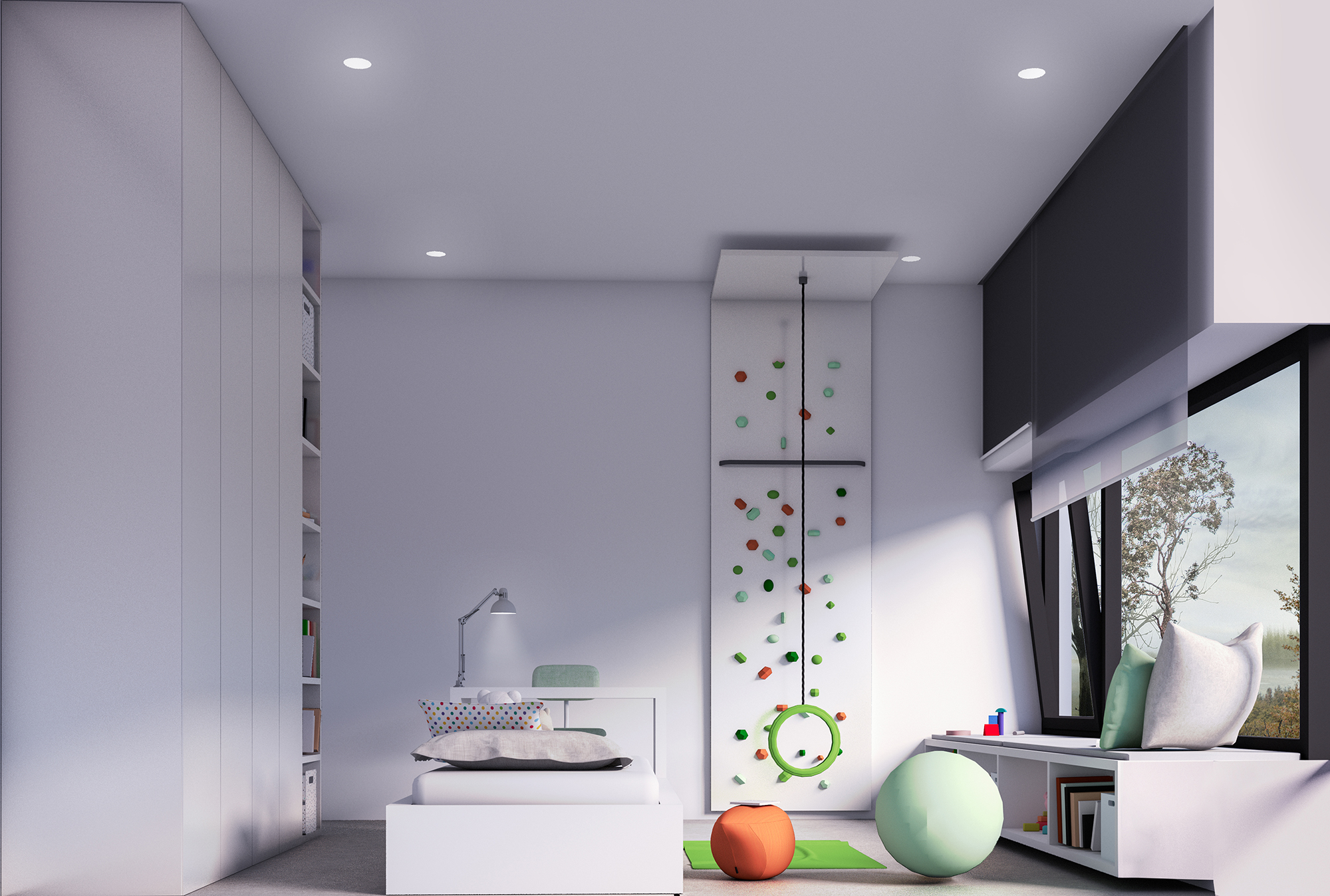
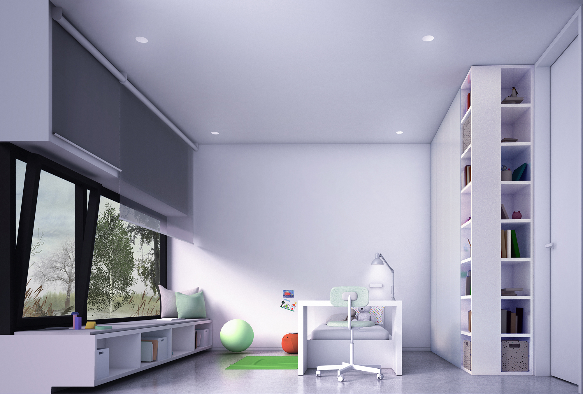
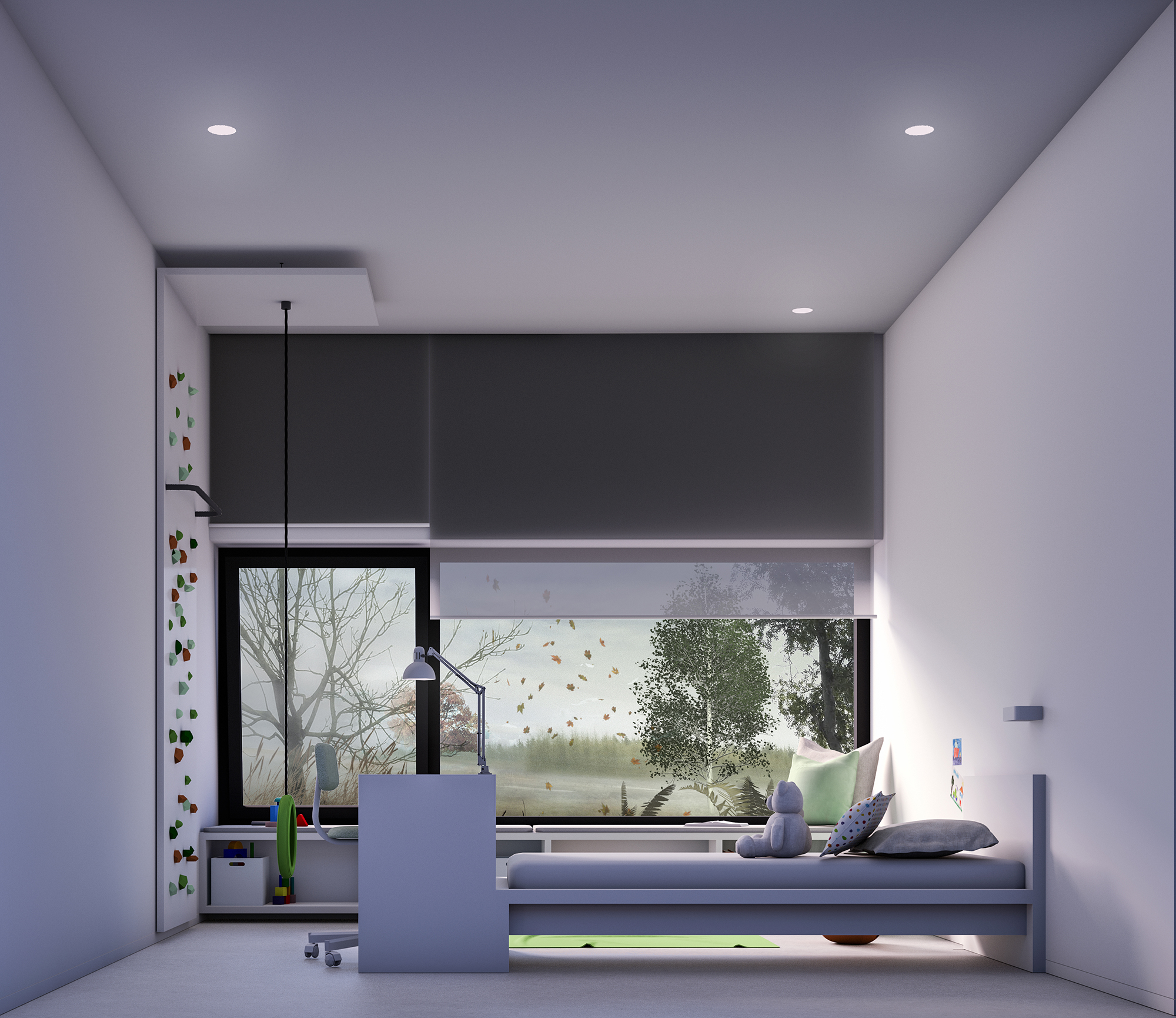
Deep window sills have been created due to the flush-fitting windows with the external façade. The height of the window sills in the night part was set at a height of 40 cm above the floor (bed level), which allowed them to be used as a place to sit. The low window sill allows the child to come into early contact with the outside world.
In the child’s room, individual furniture has been designed at the entrance wall of the room and in the window area. An individual element is also a mini climbing wall for the child. Other items of equipment come from the Ikea store offer.
more about the project: here
